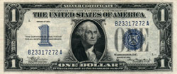
 Series 1934 $1
SC 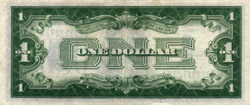 |
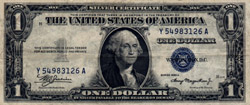
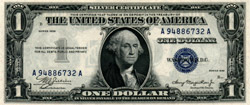 Series 1935 $1
SC 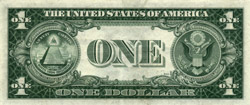 |
Series 1934 $1
SC |
Series 1935 $1
SC |
The first purely cosmetic change to the small-size currency came with the introduction of the Series 1935 $1 SC. None of the legal wording on these notes differed from that on their predecessors in Series 1934, but their appearance was substantially different. For the first time, the back design of one of the small-size notes was changed. The new back design featured the Great Seal of the United States; to make room for the seal, the large word "ONE" in the center of the note was reduced in size. The face design was also rearranged: The large "ONE" on the right side of the note was deleted, and the words "Washington, D.C." were moved up to take its place. On the left side, the blue overprinted numeral "1" was replaced by a gray numeral engraved in the printing plate. The blue Treasury seal and the serial numbers were reduced in size, while the signatures were made larger. Additionally, the signatures were no longer engraved into the intaglio printing plates, but were instead overprinted along with the seal and serial numbers. As a result of these changes, the $1 SC now had a substantially different look than the other currency of the period; but fifteen years would pass before any of the other denominations would experience a similar redesign.

A much smaller change was soon made, however, which affected all denominations and types: The plate numbers on all notes were made larger. The new larger, or "macro", plate numbers were used beginning with Series 1935A on the $1 SC, Series 1934A on the other SCs and all FRNs, Series 1928D on the $2 USN, and Series 1928C on the $5 USN. During the changeover from the smaller (or "micro") to macro plate numbers, the BEP made no attempt to pair only face and back plates of the same style; therefore, many notes were produced with different-sized plate numbers on the two sides. These notes printed from mismatched plates are referred to as "mules". On the higher denominations, old back plates with micro numbers remained in use for years, creating mules all the way into Series 1950.
The $1 SCs' changeover from Series 1935 to Series 1935A also brought one additional tweak to the new designs. The notes of Series 1935 had carried the series designation twice, in opposite corners, and it had been engraved in the printing plates. But the notes of Series 1935A instead had the series designation overprinted along with the signatures, in a somewhat larger font; and it appeared only once, close to the portrait on the right side of the note. This change meant that none of the series-specific portions of the $1 note design were engraved in the printing plates; thus, it eliminated the need for the BEP to create a new $1 master plate for every subsequent series. But again, it would be over a decade before the same alteration was made to the other denominations.
Beginning with Series 1934B, the word "The" was removed from the black Fed seals on the FRNs of all denominations, so that the seals read "Federal Reserve Bank of..." instead of "The Federal Reserve Bank of...".
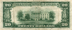
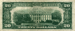
In 1948, a modified back design was adopted for the $20 denomination; the vignette of the White House was updated to show the balcony which had been added to the building. The new back also shows the White House from a slightly closer vantage point, includes more of the surrounding shrubbery, and has the title "The White House" at the bottom where the old back had had simply "White House". The change was made during the production of the Series 1934C $20 FRN, and that series exists with both back designs.
Next: The redesign of
1950