
Engraved and overprinted Fed seals
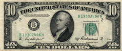
In 1950, all denominations of the FRNs were redesigned in much the same style as the Series 1935 $1 SC: The text of the legend and obligation were unchanged, but the signatures were made larger, and the seals and serial numbers smaller. Unlike the $1 SC, the FRNs retained the large spelled-out denomination behind the Treasury seal, but it too was reduced in size, and "Washington, D.C." was moved above it. Also, the signatures, the series date, the black Fed seal, and the Fed district numbers were all removed from the printing plates and added to the overprint, so that for the first time FRNs for all twelve districts could be printed from the same plates.
Soon after, very minor changes were made to the back designs of several denominations: The overall size of the back printing was reduced slightly, by cropping off a fraction of an inch of the engraved border. The $1 back was made shorter vertically, while the $5 and $10 backs were made narrower horizontally; but in all three cases the two types of backs have come to be called "wide" and "narrow". For the FRNs, these changes fell during Series 1950; for the SCs, during Series 1934D and 1935D; and for the $5 USN, during Series 1928F. The change was permanent for the $1 and $10, but the $5 actually reverted to the wide variety fairly soon. For all three denominations, the BEP used all available printing plates indiscriminately during the changeover, so the wide and narrow varieties are found mixed together in consecutive packs of new notes from the period.
In late 1952, the BEP began its conversion from printing presses which produced 12 notes to the sheet to larger ones which printed 18 notes per sheet. The $1 SC was first to be produced on the new presses, making the change toward the end of the Series 1935D run. The FRNs made the transition between Series 1950 and 1950A. And the USNs and higher-denomination SCs changed to the larger sheets at the same time as they were finally redesigned to conform with the FRNs and the $1 SC, leading to the creation of Series 1953.
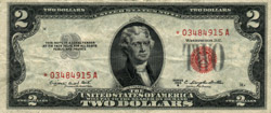
The change from the 1934 series SCs and the 1928 series USNs to the Series 1953 notes of those types was, once again, an entirely cosmetic one. None of the wording on the notes was changed, but the new designs had the smaller seals, overprinted signatures, and other features that were introduced with the 1935 and 1950 designs. In particular, the Series 1953 USNs were the first notes of that type to carry the Treasury seal on the right side. Both the USNs and the SCs of Series 1953 had a gray denomination numeral at left, just as did the $1 SCs of the 1935 series, which still continued in production. Oddly, the $2 USN face design now again appeared without the lathework which had been added for Series 1928C, though no other denominations or types experienced lathework changes in the 1950/1953 redesign.
When these changes were complete, in late 1953, all types of all denominations of U.S. currency were once again broadly similar in design. The $1 SC remained a bit nonstandard in that it alone lacked the large spelled-out denomination behind the Treasury seal, but there were no major design differences as there had been during the previous dozen years, when the 1928, 1934, and 1935 designs had all been in production simultaneously.
Next: In God We
Trust