Series 2004 $20 note
When the notes of Series 1996 were introduced, the Treasury indicated that these new designs would not be so long-lived as their predecessors. Instead, redesigns would occur much more frequently, keeping U.S. currency always ahead of the advances of those seeking to counterfeit it.
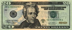
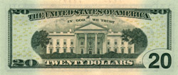
In keeping with this policy, a new $20 note design was released to circulation late in 2003. The new notes, dated Series 2004, were the first small-size notes to be printed with background color; they had peach, green, and blue tints. These notes also retained, and improved upon, the security features introduced with the 1990 and 1996 series. Microprinting was present in both the engraved black face design (along the bottom border just below the Treasurer's signature) and the blue face underprint (along the edges of some of the letters in "USA TWENTY"). The color-shifting ink showed a greater color change than did that used on the Series 1996 notes, changing from green to a bright copper color instead of from green to black. In addition, a new metallic ink was used for the small eagle and shield just to the right of the portrait, and a yellow ink, difficult to photocopy, was used for many small numerals "20" on the back of the note.
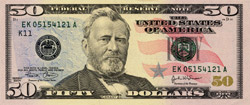
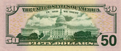
The second redesigned note in this series, the $50, was issued in late 2004. The $50 had tints of peach, purple, blue, and red in the background; this different color scheme made the $50 visually distinct from the $20 despite their general similarity of design. The $50 also had a large untinted space on the back for the vignette of the Capitol building, allowing the traditional green back printing to appear more clearly. Additionally, the $50 retained all the security features of the $20. Microprinting was present in two of the stars in the left background, as well as in its former locations in Grant's collar and in the side borders of the face design. The color-shifting ink on the face, and the yellow ink used for the many small numerals "50" on the back, were the same as on the $20; but the blue star just right of center on the $50 used a different metallic ink from the green eagle on the $20. Finally, the watermark of Grant remained in the paper at far right, and the polymer strip embedded in the paper was widened slightly, to make the flag design and "USA 50" on it larger and easier to see when the note was held to the light.
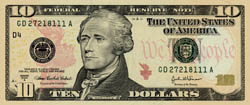
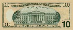
The colorised $10 note was released in early 2006. This note had background tints of peach, orange, and red. Like the $50, the $10 had an untinted space on the back around the vignette. However, the $10 also had additional untinted areas on both sides around the watermark, and had a single-color back tint instead of the three-striped pattern appearing on the $20 and $50. Microprinting appeared in both side borders of the face design, along the ribbon carrying Hamilton's name, and along the lower edge of the red torch at left. Small yellow numerals "10" appeared on the face side of the note as well as the back. The color-shifting ink was like that on the colorised $20 and $50, while the red metallic ink used for the torch to the right of the portrait was new. The paper retained a watermark of Hamilton, and also a polymer security thread of the same width as that in the previous $10 design, not of the increased width used in the 2004 $50.
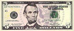
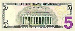
The next denomination to be colorised was the $5, released in early 2008. Its background was tinted pink, gray, and purple; it followed the $10 in having untinted areas surrounding both the main watermark and the back vignette, but it followed the higher denominations in having a three-striped tint on both sides. The watermark at right was changed from Lincoln to a large "5", and three more numerals "5" appeared as watermarks just left of the portrait. The polymer security thread was moved to a new position between the portrait and the Treasury seal, and the printing "USA 5" on it was now in a completely different style than used on other denominations. Small yellow numerals "05" appeared on both sides of the note, and microprinting appeared in both side borders of the face design, in the purple shield on the face, and also in the large purple "5" on the back--the first use of microprinting on the back side of a note. The $5 lacked both the color-shifting ink and the metallic ink used on the higher denominations.
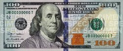
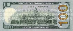
After significant delays occasioned by production problems, the colorised $100 note was released in late 2013. In addition to the security features found on the lower denominations, it featured an embedded strip with images that appeared to move and change when the note was tilted. The note was tinted purple, blue, and brown, and had a very large numeral "100" on the back in orange, running vertically up the entire right end of the note. Unlike the previous notes of this design generation, the $100 had an entirely new back vignette, showing Independence Hall from the opposite side. Unlike the previous-generation $100 design, it carried an overprinted Fed seal and a black district code, as did all the other denominations of both generations.
This colorised $100 completed the 2004 design generation; as in the previous cycle of new designs, no changes were made to the $1 or $2 notes.
Next: Another round of
printing upgrades